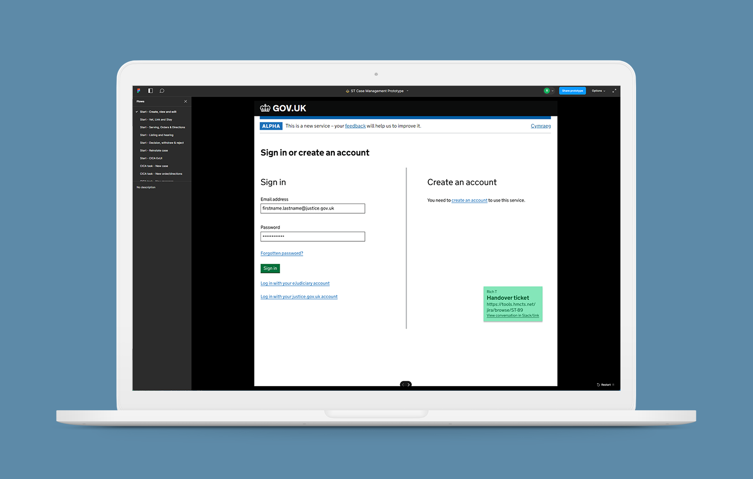
Background
HMCTS is the UK Government's Courts and Tribunals service. As part of wider reform plans, a significant budget was allocated to modernise the Special Tribunals appeal process. The goal of this project was to build a digital service that allowed Special Tribunal appeals to be started and managed online, ensuring accessibility and usability for all.
Goals
- Wireframe, prototype, test and iterate the public facing Special Tribunals service
- Prototype, test and iterate the case management platform used by civil servants
- Strictly adhere to GDS principles by using HMCTS approved component libraries but...
- Take full advantage of any opportunities to improve existing components
Timeline
- Feb 2022 - Oct 2022 (Special Tribunals)
- Dec 2022 - Sep 2023 (judicial payments, probate and bulk claims management)
What was needed
The planned "service" (AKA "website", "web app" or just "app" in the non-government sectors), was to consist of two very different but equally essential entry points: a website for universal accessibility and a much more complex management dashboard for use by civil servants, caseworkers and judiciary. The team had been tasked with creating a digital service that would enable Special Tribunal appeals to be lodged online, expanding beyond the limitations of a previously paper-based process.
Thankfully, there was already a service map in place when I joined the team. This was like turning up to build a house when all of the (very strong) foundations have been laid. Not only was there a hugely detailed service map, but it was backed up with a massive amount of research around what caused the users of the paper-based service the most headaches (otherwise known as "pain points" to user experience designers everywhere). With the early research completed and the service map in place, we were ready to begin the wireframing process.
What I did
The most important thing I could do at this early stage was spend a good chunk of time working with the service designer ("an interaction designer's best friend") to get a handle on the problems we were trying to solve. It's easy to see a service map, focus on a specific pain point (usually one that many people have brought up) and jump straight into trying to solve it - it's what we do, after all! Fortunately, the service designer I was working with was great at keeping easily distracted interaction designers under control, ensuring I kept the broader service in mind.
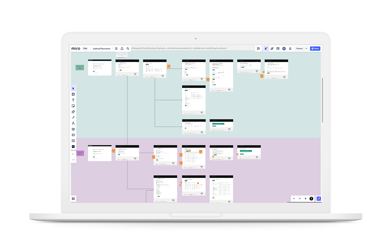
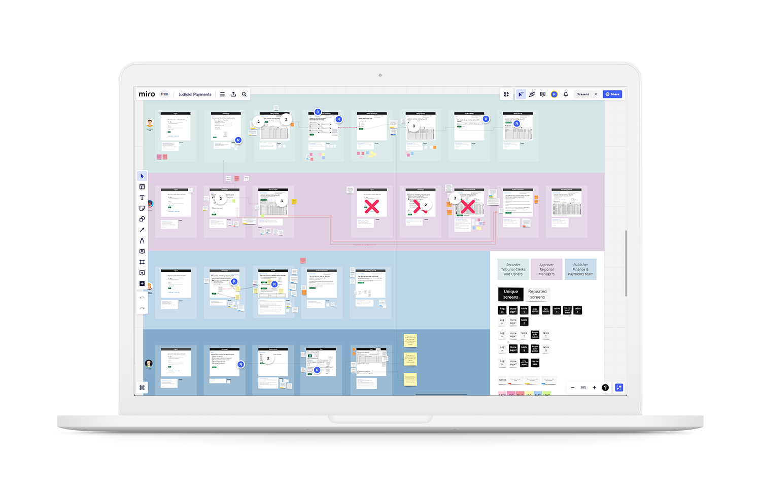
Once I had a good understanding of what the new digital service was hoping to achieve (and had completed a crash course on the specifics of the First-tier Tribunal - this was a lot), it was time to start working on the wireframes. In previous jobs, this is when I'd have reached for something like the now defunct AdobeXD, or the (still funct?) Axure. If you're curious, you can see an example of an Axure prototype in the LoLo case study. I soon learned though, that the standard web app used by GDS for wireframing is Miro. I'm always eager to try new (to me at least) tools though, so this was a great opportunity to do so.
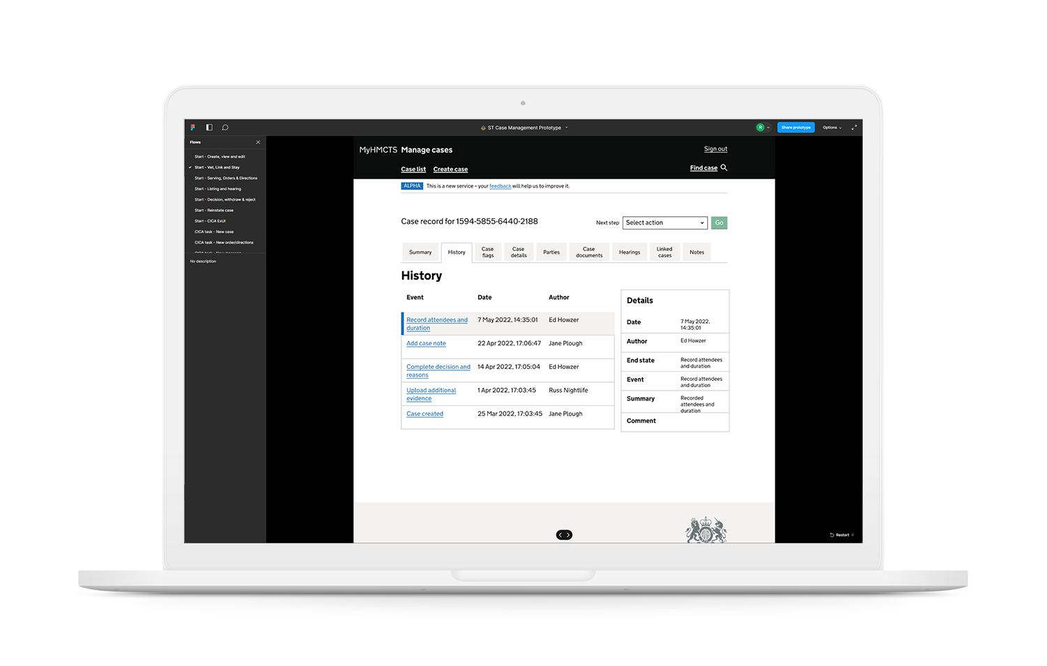
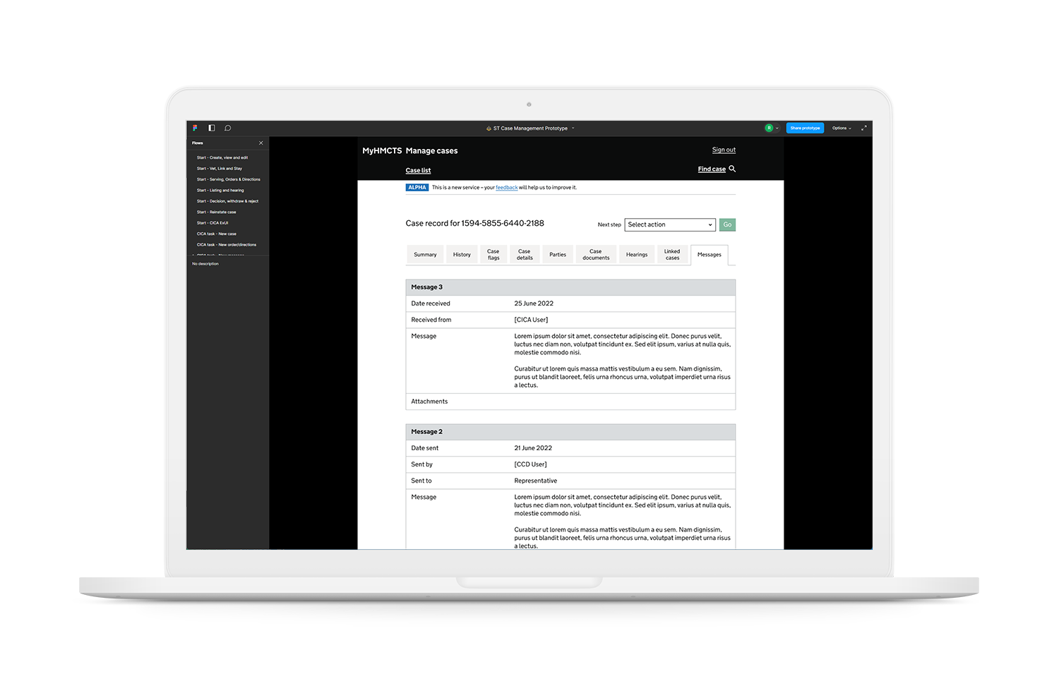
The final stage of the year-long Special Tribunals Reform project was to build the clickable Figma prototype for the case management dashboard. This was, by far, the biggest and most complex prototype (roughly 700+ frames and 100+ branches) I've ever made in Figma, but Thankfully it was more than up to the task. Of the 12 potential First-tier Tribunals, this dashboard was designed to handle 5. This number had been reduced from 9 initially, when it became apparent that the other tribunals were just too complicated for the idealised / hoped for "one size fits all" solution.
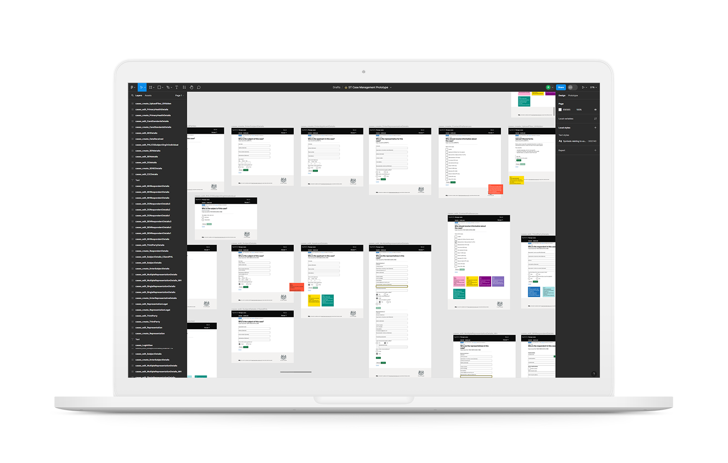
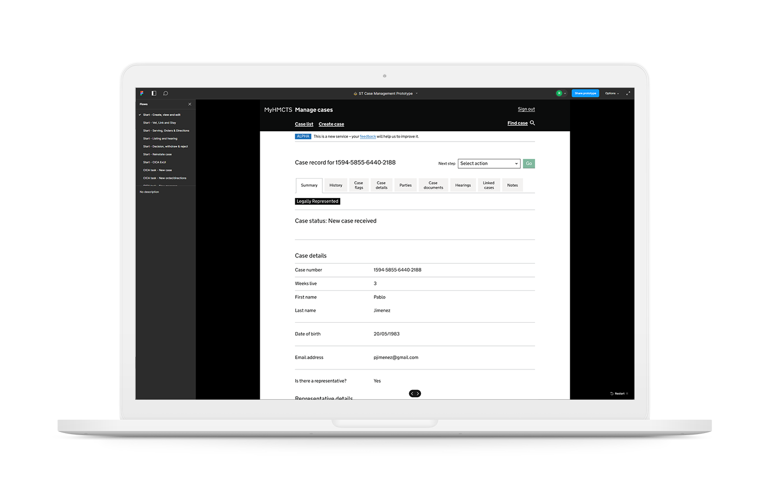
Up until now I've been referring to a single prototype, but I actually ended up completing and handing over 10 self-contained prototypes to the dev team to build. The eagle-eyed among you may be able to make them out in the screenshot below - each item on the left-hand menu is a unique entry point to a different part of the service. It's always a little nerve-racking when it's time to hand over something you've worked on so closely for so long, but after the first couple, it became much easier. My background in web development helped too - before I make a UX decision, I'm usually able to draw on my experience in order to better understand how a potential solution may work in code. This also puts me in a better position when it comes to handling questions from the more development focused stakeholders on a project.
Results
As the sole interaction designer, initially hired for just two months, I received three extensions in total. This, satisfyingly, allowed me to be a part of the Special Tribunals reform project from conception to completion. In addition to being involved in the life cycle of the service, I also became something of a subject matter expert, allowing for continuity of knowledge across multiple teams over a period of some churn.
On completion of the project, positive feedback highlighted the scope of my contribution, the quality of my work and how well I fitted into a number of well established, cross-discipline teams. This led to another year of working with HMCTS on an additional three major services: judicial payments, probate reform and bulk claims.
The most satisfying result for me was having to re-learn almost everything I knew about users. My design work in the private sector has always been on apps or websites trying to carve out space in an often competitive market - for example accounting, logistics, loyalty or legal services. I can do my best to design for a specific demographic, but there's always a competing product and there's nothing to stop your users moving to a competitor. The things I've designed for the UK Government are very different though - they need to work for everyone, regardless of technical ability, background or in many cases when English is not their first language.
